ShopDreamUp AI ArtDreamUp

Deviation Actions


Suggested Collections


You Might Like…


Featured in Groups

Description
Zara, 7 weeks old.
Please respect the model : )
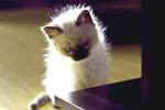
Also, from the same shoot:
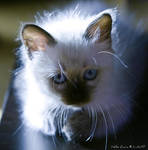


 © Lintu47. My artworks do not belong to the public domain and you may not sell, repost or use them in any way without my written permission. All rights reserved.
Please respect the model : )
Also, from the same shoot:
Image size
3888x2592px 1.71 MB
© 2011 - 2024 Lintu47
Comments260
Join the community to add your comment. Already a deviant? Log In
Firstly, I applaud your efforts and is that kitten tamed? If not, I'll give you an A for kitten photography.
Secondly, If your main focus is the eyes and you wanted to blend your cat body into the blurred, I would prefer a more zoomed in version since there's no detail in the background that the audience can look at.
Thridly, please be... I'm not sure of the word... maybe "bolder" in your execution? Because there are a few things in this photography that I see and make me suspect whether you had "accidents" or elements are intended.
For example, there is some blueish thingy under it's chin. Was it intended? Or accidental? Or it is just from some light source you couldn't control? If it's intended, a more distinct blue shade under it's chin and more visible blue shade at the side of it's body would bring out this piece. If the blue was not planned, either dim it further or remove it completely because it doesn't complement the cat's eyes.
Another example is the ears, one is more blurred or grey as compared to another. Is it intended? Or accidental? I mean maybe you can answer me in a private message because I'm curious too. <img src="e.deviantart.net/emoticons/s/s…" width="15" height="15" alt="
Hence, I prefer zoomed in version because I assume the focus is on the eyes (intended or accidental?). Little details contribute to the deviation ratings if one seriously and take their time to consider your piece because you're worth it. I like how you put your name in a comfortable font and position in the picture. <img src="e.deviantart.net/emoticons/s/s…" width="15" height="15" alt="
Lastly, hope this help for your future projects as well as anyone else. I saw you other gallery pieces and please keep your awesome works coming! <img src="e.deviantart.net/emoticons/b/b…" width="15" height="15" alt="